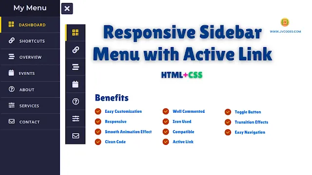
Responsive Sidebar Menu with Active Link Using HTML and CSS
How to create a responsive sidebar menu with an active link effect to fit into today’s web designs? A sidebar menu enables users to explore other parts of a site without removing the main content out of sight. Being responsive, this sidebar suits any screen size, and it is therefore easily navigable on both desktop and mobile devices.
Source Code: Responsive Sidebar Menu with Active Link
Moreover, having an active link feature means that at all times, the users will be able to have their current page highlighted visibly which will make navigation easier and much more satisfying for the users.
Here I will give you a Free Source Code for Responsive Sidebar Menu with Active Link Using HTML CSS.
GitHub Source: Responsive Sidebar Menu
Features
- Compatibility: This menu structure supports all modern browsers and is optimized for the visual display on different portable devices.
- Clean Code: The code is well commented and very easy to follow even for a person who has little or no knowledge about the programming language.
- Responsive Design: Mobile responsiveness for viewing in desktop and mobile.
- Active Link Highlighting: The current page is displayed with highlight active link color.
- Smooth Transition Effects: It has High fluid animations and swipe for opening & closing.
- Toggle Button: Allows for easy use to open/close the menu.
- Customizable Icons and Text: Provides text support alongside icons to minimize confusion when choosing an option.
Technologies Used
- HTML (Hypertext Markup Language)
- CSS (Cascading Style Sheets)
Recommended for You
- Neumorphism Side Bar Menu
- Sidebar Menu with Sliding Submenu
- Glassmorphism Sidebar Menu
- Responsive Sidebar Menu with Social Media Buttons
- Responsive Sidebar Menu With Dark and Light Mode
Video Tutorial
https://youtu.be/1AYxXIIMQT0

0 Comments